Results of a Basic A/B Test
About 1 month ago I released Grid Draw V2, an app for creating iconography and other types of symmetrical art—available for both iOS and MacOS.
The app has been suffering from poor retention so I wanted to understand why people are downloading it. Are these people looking to create their own art, or download existing art?
In hopes of answering that question I created a simple onboarding experience with a basic A/B test.
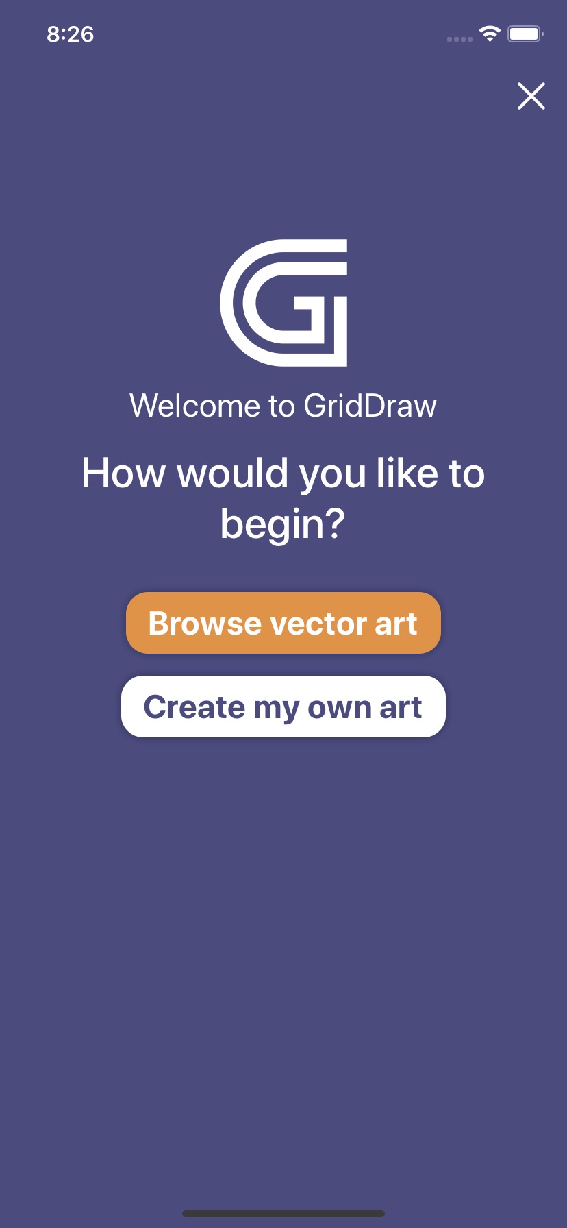
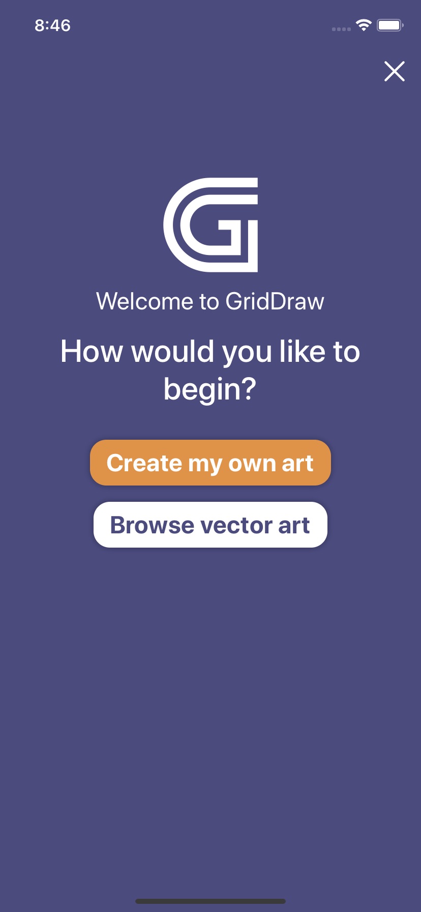
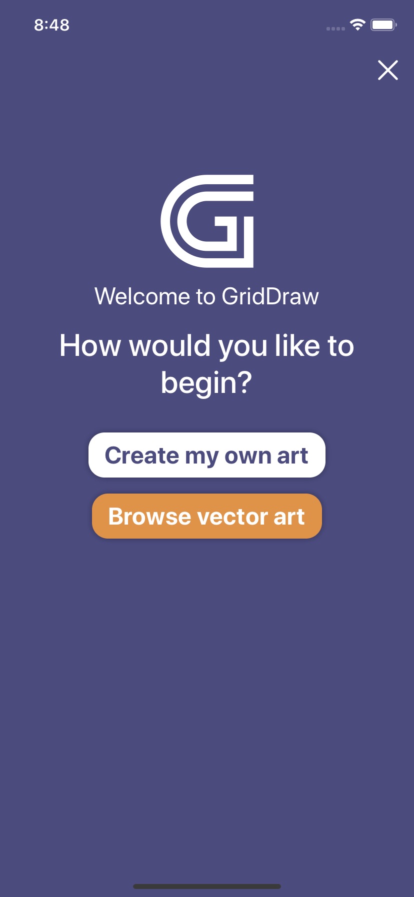
After installing the app for the first time people see an introductory overlay with one of the following (random) variations:


See the difference?
As you may have noticed, I randomized the positioning and color of the two buttons to remove any possible bias those factors may have theoretically caused.
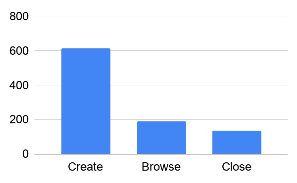
This experiment has been in production for just under a month now and I thought id share the results so far...

It's pretty evident that most of the people downloading Grid Draw are looking to create stuff.
With some data to back it up, I'm beginning to form a new theory about why retention continues to suck so bad.
It must have something to do with usability. People are probably abandoning the app because it doesn't make sense to them—it's not "intuitive."
And that can be a difficult nut to crack...
